Bitmap Font Configuration
Since I use a 4K TV as a monitor (and sit danger close), I thought I’d try using bitmap fonts. Without antialiasing, small text will be much crisper, easier to read, and brighter on the OLED screen.
From the Arch User Repository, I installed ttf-unifont for body text and cozette-otb for taskbars, etc.
To discover how the X window system internally calls these fonts, I used the bash one-liner (source)
fc-list | cut -f2 -d: | sort -u
I want to use Unifont JP to render body text, so running the above script tells
me that /usr/share/fonts/Unifont/Unifont_jp.ttf is named Unifont\-JP.
Doom Emacs
Doom renders Unifont without a fuss. In the doom/config.el file:
(setq doom-font (font-spec :family "Unifont\-JP" :size 16)
URxvt
URxvt needs a couple extra options to render properly. In the .Xresources file:
URxvt.font: xft:Unifont\-JP:pixelsize=16:antialias=false
For reference, a normal font has the fields like the following:
URxvt.font: xft:Noto Sans Mono:size=24
i3 and i3status
In the top level scope of the .config/i3 file:
font pango:Cozette 13
You can also set a font in the bar { } scope, if you want it to be a
different size. For cozette, this is a multiple of 13px.
Launcher for dmenu:
bindsym $mod+d exec --no-startup-id dmenu_run -fn 'Cozette-26'
Postscript
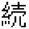
It seems like the JP code points aren’t entirely Japanese-style, but I could be missing something. Compare, for example, 続, a commonly-used character.
From glyphwiki:

From Unifont:
Post-postscript
I think it’s funny how at 16px scale, the eye bends the objectively-level three dots in the left-hand radical of 続 into the calligraphic norm.